
Published 2 December 2014 by Wolfgang Huang
A Statistical View on the 2014 Meetings
609 participants from 80 countries at the 64th Lindau Meeting, and 458 from 86 countries at the 5th Lindau Meeting on Economic Sciences – these numbers (and there are more!) are too tempting to not look more closely.
Gender Ratio of Participants by Continent
Gender was one of the big themes especially of the medicine meeting, where for the first time more female than male young scientists participated. Some may say that this is not at all impressive, looking at the number of female students studying medicine, but one has to take into account that Lindau participants come from all over the world, precisely from 80 countries in this case. And there are, although we may not like it, still many structural differences in study and career advancement in different countries. So instead of giving you a pie chart with a 52,3% slice for the female scientists, we wanted to look into how the gender ratio has developed from “last decade” to “this decade”, and how the development for the different continents looks like.
The chord diagram below compares the gender ratio for all the meetings held 2004 – 2010 to those held 2011 – 2014, and it shows the result grouped by continent, i.e. the continent the nominating institution is located on.
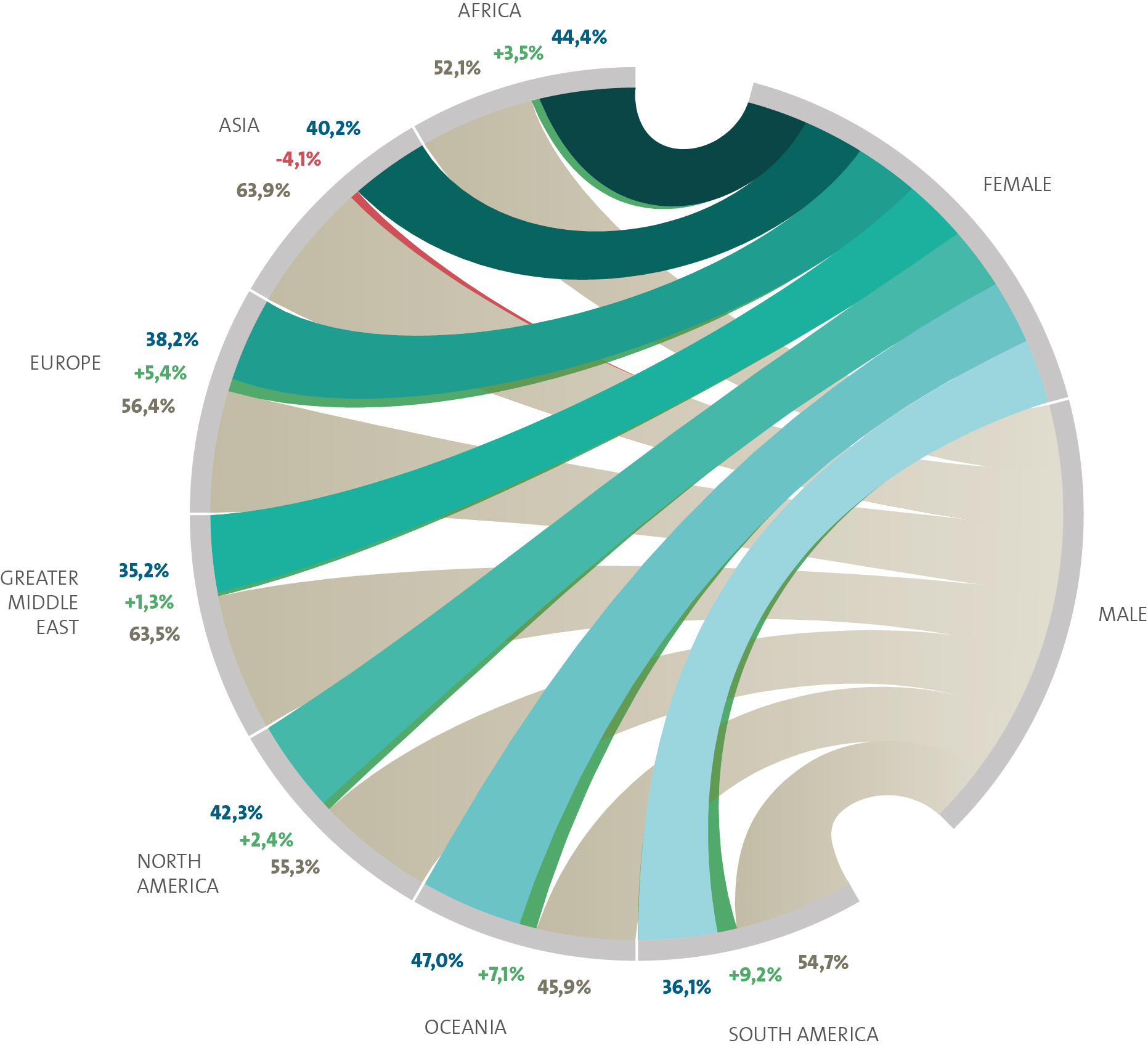
How to read it
If you look at Oceania, for example, which is the second-to-last segment before the gap on the bottom, you will find three numbers, corresponding with three “chords”. The first one tells you that in average between 2004 – 2010, 47% of the participants were females. Compared to the average of 2011-2014, the female share has increased by 7.1%. It is, for this latter or second period, thus at 54.1% (47+7.1). The share of male participants in the second period is 45.9%. It was 7.1% lower in the first period, i.e. it was 53% (45.9+7.1 or 100-47).
Interesting facts
As was to be expected, the female share has increased in all continents – except for Asia, where the female share has decreased by 4,1%. Why, we don’t know yet. Notable is that Oceania has the highest female share with 54,1%; equally interesting is that South America has experienced the highest increase in the female share with 9,2%.
TOP 200 University Cities of Lindau Participants
Looking at continents, we also wanted to know where exactly Lindau participants come from, especially from which cities. Here are the results:
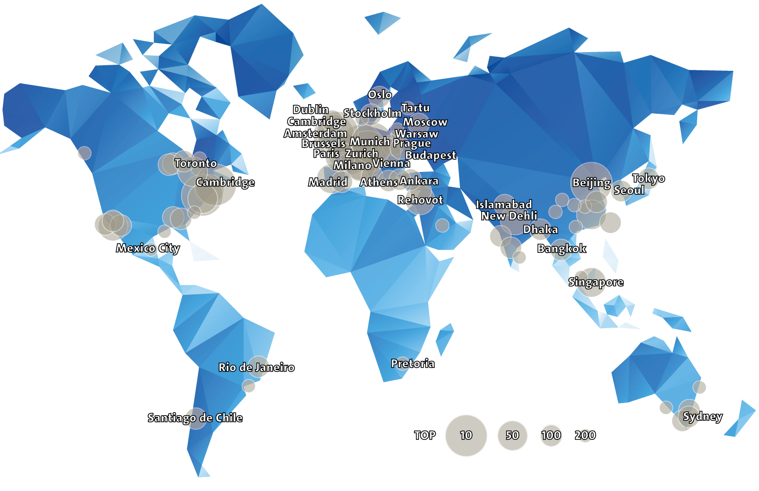
How to read it
Again, we looked at our dataset from 2004 to 2014, and identified which city (where students studied or worked) was most popular in each country. The top 200 are depicted by circles, and the size indicates if they belong to the top 10, top 50, top 100 or top 200. We also stated the #1 city name for the top 35 countries (not cities!).
Interesting facts
When we developed this map, we immediately noticed that it is partially misleading: For example, the second most common city in the USA is Washington, depicted by the large circle slightly left and below of Cambridge (USA). However, the name nowhere appears, although there are far more students from Washington than from, say, Tartu (which is mentioned by name). Also, there are many European cities that simply cannot be identified because there are too many circles. Plus:885 cities appear in our list of study or workplaces, but only 200 are shown, which leads to some misbalance for example for Africa and Latin America. If your city is missing, it is propably #201.
Still, the map shows what it promises (but nothing more): The 200 most popular study (and work) cities of Lindau participants. It reveals the scientific hubs on the US East and West Coast, in Central Europe, and in Asia. Honestly: There are no big surpises unveiled in this bubble graph.
Study Destinations
We now know where students go to, but where to they come from? Country-wise, of course. To answer this question, we looked at our data from 2014, where we had the most complete information. And we linked the country of birth to the country where students study.
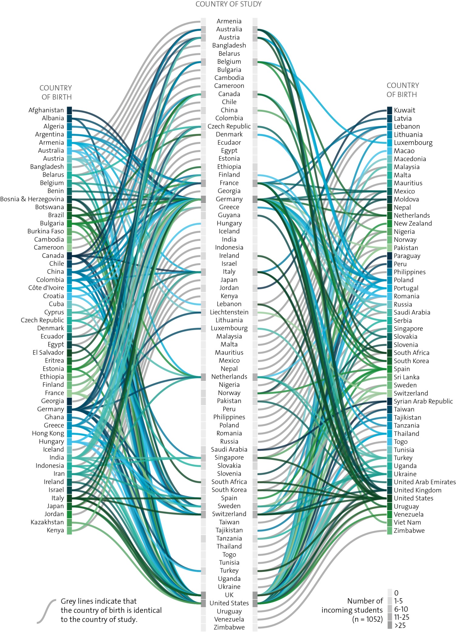
How to read it
This graph can be read in both directions – you can either start on the outer sides (country of birth) or in the middle (country of study) and follow the lines to the other end. The blue-green color range is only used for distinction and does not carry any additional information. Grey lines however indicate that the country of birth is identical to the country of study, which means that there is no movement – students stay in their home country. The various grey colors in the middle column indicate how many students study in this particular country, from a total of 1052 Lindau participants in 2014.
Interesting facts
When putting together all the lines, it was interesting to learn which countries are very popular where you would not expect it in the first place: The Netherlands, Austria, Singapore, Switzerland. Then again, when you think about it twice, there are always good reasons for it, such as a leading university, a historical role, or an aggressive national strategy to attract top students. Apart from those mentioned, the UK and USA are very strong, as well as Germany, which may be a bit overrepresented due to the fact the Lindau meetings take place in Germany.
It is also interesting to see that there are countries from which Lindau participants originate but where none of the Lindau participants study (e.g. Afghanistan). And if you follow the lines very closely, you may see many remnants of historical relations between countries, which may explain why many students head to a particular country (such als Algeria – France or Slovakia – Czech Republic).
Academic Degree and Age
There is one rule and one goal (among many) for the selection of Lindau participants: They shall not be above the age of 35, and there shall be an equal representation of undergraduates, PhD students, and post-doctoral students. Let’s see if we accomplish that:
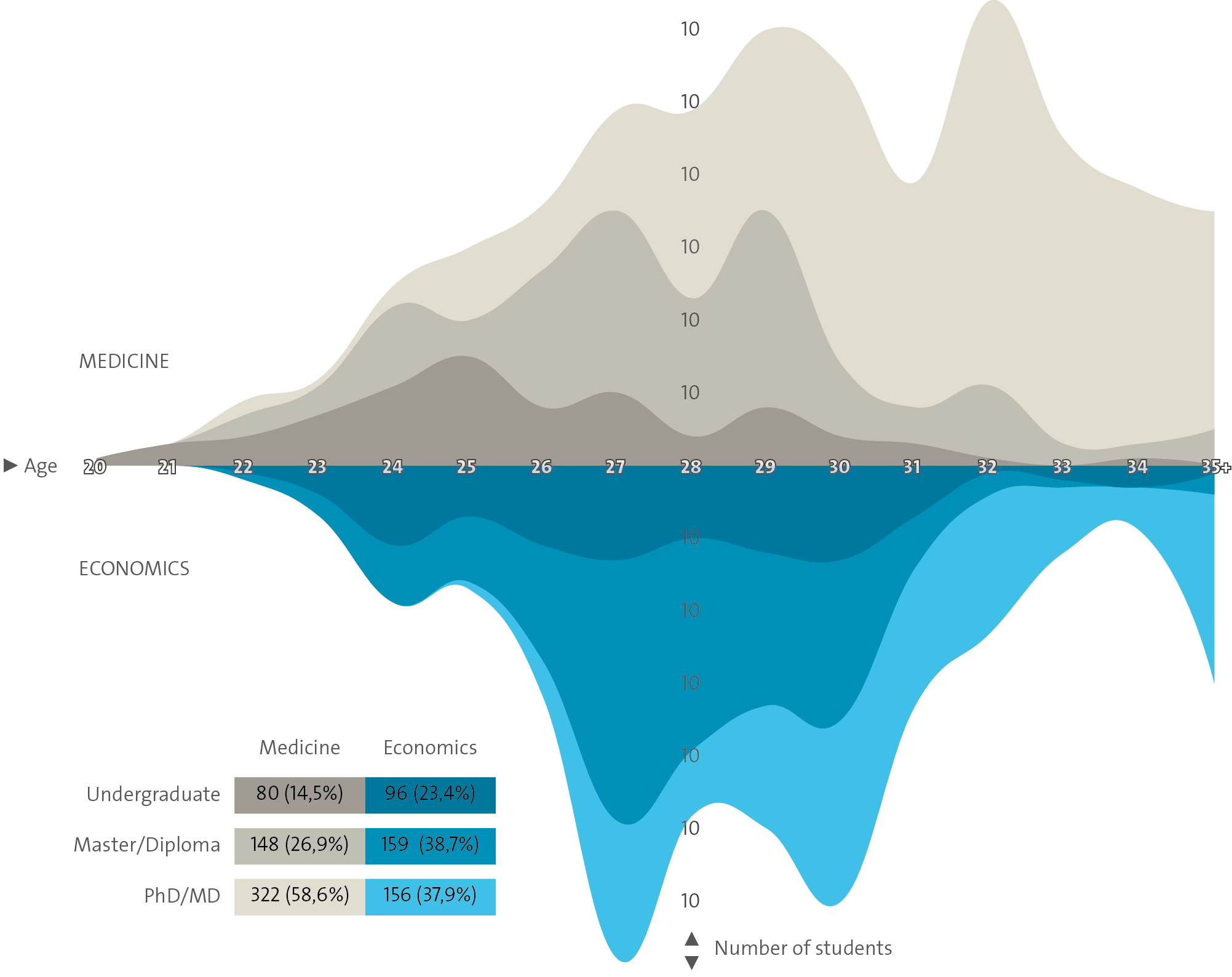
How to read it
The stacked values of this stream graph show how many participants of which age hold a certain degree. For example: At the 64th Lindau Meeting (Medicine), 4 students aged 28 were undergraduates, 19 held a masters degree, while 23 had a PhD/MD. The size of any particular area is equal to its share (and you may not extend any area to the x axis, if/because it is stacked on the area below). The dark brown area should thus be equal to 14.5% of the overall brown area. The data refers to the two meetings held in 2014, medicine on the top, economics at the bottom.
Interesting facts
The data in this chart seems to support the conclusion that there are more PhDs/MDs in the scientific discipline of medicine than in economics, but that economics students obviously tend to obtain these degrees earlier in their academic career. As for the goal of an equal representation: It has only been partly met.
Lindau’s Impact
Finally, we wanted to know whether we were successful in what we are trying to achieve: Did the meeting have the impact that we hope for?

How to read it
The questions and answers are taken from the 2014 participant surveys. The participants had five answer options on a scale from 1 (very much) to 5 (not at all). Each circle represents a question, and the smaller the gap (on the right), the better.
Interesting facts
The results are (fortunately) similar to those of previous years: The overall assessment is very positive. We are particularly proud that almost all participants say that they do consider themselves to be Lindau Alumni. This result will be the basis for one of our next major projects – so keep visiting our website and the blog frequently to stay up to date.